Brand guide · v1.1 · September 2026
Connecting People, Place & Planet
The single source of truth for the mark, the palette, the type, the voice, and the way we show a home. If it is not in here, it is not Curio.
Copy the tokens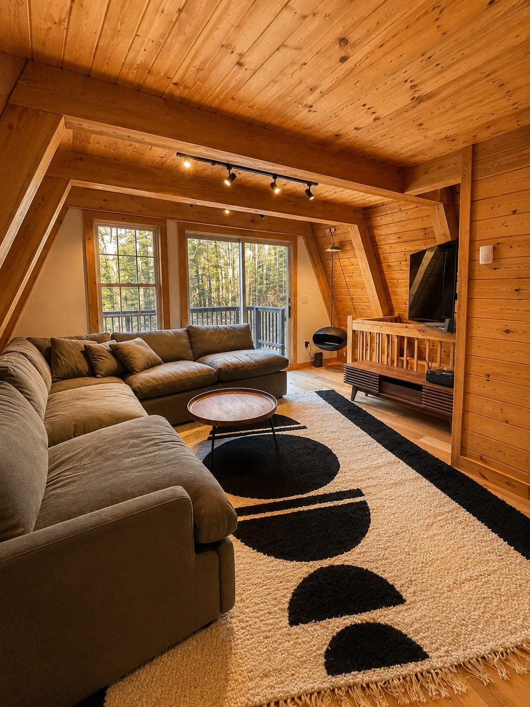
01
Every rule in this guide serves one idea. Start there and the rest makes sense.
A home is not a container. It is an ecosystem of living beings, rhythms, memories, and matter.
Curio Studio Interiors is a residential interior design studio rooted in the Hudson Valley, led by principal designer Savannah Dodge. We design homes for the specific people and the specific place, with materials chosen for their story as much as their look. The tagline carries all three: Connecting People, Place & Planet.
People
The psyche, made spatial
Design, done well, is inquiry before intervention. I don't design for myself; I design for the people living within a specific home. We translate the inner world of your psyche into the outer world of your home: spaces that hold complexity, ritual, and real life. Refuge, not performance.
Place
Design belongs to its context
Our work is rooted in place: the light here, the landscape, the particular character of these Hudson Valley homes. A home should feel inevitable in its setting, not imported into it. Great design belongs to where it stands.
Planet
Regenerative by intention
A home is an ecosystem of living beings, rhythms, and matter, coexisting on behalf of one another. We design regeneratively: materials chosen for their story and their footprint, an ecological relationship honored rather than ignored.
The three pillars, word for word from the About page. Copy them exactly; never paraphrase them.
Each belief is a test. If a piece of work, a sentence, or a photo breaks one, it goes back.
A deep, grounded red that reads like wine, clay and old wood. It carries the logo, the headings, and the one primary action on a page.
Every color here sits on the warm side. Cool blues and greens fight merlot, so they stay out of the palette and out of the hero images.
The canvas is off-white, the color of unbleached linen and plaster. Pure white reads clinical, so it is saved for print on white paper.
It is written to be handed to three audiences and produce the same result from all three.
Take the files from chapter 02, the colors from 03, and check your copy against 05, and see it all applied in 08.
Paste the tokens from chapter 09, or use the Tailwind classes the site already ships. Never retype a hex by hand.
Give it the whole page, not a summary. The hex values, ratios, and voice rules carry the weight, and a summary drops exactly those.
02
An interlaced CS monogram and a CURIO STUDIO wordmark set in ITC Eras Medium, both converted to outlines. Use the file. Never type it.
Three arrangements and one tile. Each ships as an outlined SVG (the master) and a 300 dpi transparent PNG.




Merlot on a light field, or off-white on merlot. That is the whole list.
03
Nine colors, all of them warm. Every one has a job. If you are reaching for a tenth, the layout is wrong, not the palette.
Select any swatch to copy its hex.
Measured, not eyeballed. AA needs 4.5:1 for body text and 3:1 for large text (24px, or 19px bold) and graphics.
| Pair | Ratio | Verdict |
|---|---|---|
| AaMerlot on Off-white | 13.39:1 | Pass AA |
| AaCharcoal on Off-white | 12.36:1 | Pass AA |
| AaOff-white on Merlot | 13.39:1 | Pass AA |
| AaButter on Merlot | 11.13:1 | Pass AA |
| AaCharcoal on Butter | 10.27:1 | Pass AA |
| AaMustard on Merlot | 7.44:1 | Pass AA |
| AaWarm gray on Off-white | 4.67:1 | Pass AA |
| AaCopper deep on Off-white | 4.61:1 | Pass AA |
| AaOff-white on Copper deep | 4.61:1 | Pass AA |
| AaCopper on Off-white | 3.87:1 | Large only |
| AaOff-white on Copper | 3.87:1 | Large only |
| AaWarm gray on Butter | 3.88:1 | Large only |
| AaLime on Off-white | 1.93:1 | Never |
| AaMustard on Off-white | 1.80:1 | Never |
04
Sans-serif, everywhere, always. Questrial leads, Arial carries the reading, Tenor Sans labels the nav. No serif, ever.
Display and headings
AaPage titles, section heads, card titles, pull quotes, the tagline. A clean humanist sans that sits comfortably beside the Eras wordmark. One weight.
ABCDEFGHIJKLM
abcdefghijklm 0123456789
Body and interface
AaEvery paragraph, list, caption, button, eyebrow and form field. Installed on every machine, so documents and email match the site.
ABCDEFGHIJKLM
abcdefghijklm 0123456789
Navigation
AaThe top nav labels only. The closest free match to the Eras wordmark, so the header reads as one piece with the logo.
Services · Projects · Studio · Journal
Six sizes for the web. There is no seventh. If a line does not fit, cut words; do not invent a half size.
A home that looks like the people in it
How a project unfolds
Materials that carry a story
Before we suggest a single change, we want to know how your mornings go, where the light lands, and which pieces you would never part with.
The Curio way
Photographed in the Berkshires, late October.
Connecting People, Place & Planet
font: 400 56px/1.05 'Questrial'; color: #42041C;Planet
Where a thing came from, what it cost the earth, how long it will last: these are design decisions, not afterthoughts. We choose wool, wood and stone the way you would choose a friend, for the long run.
Questrial 56 display · Copper rule · Arial 16 body · Arial 11 eyebrow · Arial 13 micro
Questrial and Tenor Sans are free on Google Fonts. Arial ships with every computer. ITC Eras lives only inside the logo files.
<link href="https://fonts.googleapis.com/css2?family=Questrial&family=Tenor+Sans&display=swap" rel="stylesheet">05
Warm, curious, grounded. We ask before we tell, and we write about homes as places to live, never things to look at.
A designer sitting with the people who will live in the home. Quiet confidence, plain words, and a real interest in how they live. Every line should sound like it came from someone who has been in the room.
Inquiry before intervention holds for copy too. Open with the person and how they live, then the design.
There is no Curio look. Describe the home the client is already asking for, never a style we sell.
Homes are for living. Never sell a room on how it photographs or who it impresses.
Read the copy aloud as if you are sitting at a client's kitchen table on the first visit. If a line would sound like a sales pitch in that room, or treats their home as something to be seen rather than lived in, cut it. They invited us in to listen first.
One word per thing. When the same idea goes by three names across three pages, readers assume they are three different things.
| Say | Not | Meaning |
|---|---|---|
| home | property, unit, square footage (in client copy) | Where people live. It is never an asset in our copy. |
| way in | package, bundle | One of the five service levels, from fully managed to lightly guided. |
| Custom-scoped | "starting at", price on request | How Full Service, Procurement and Spec Book are priced: by written proposal. |
| regenerative | eco-chic, green luxe | Materials chosen for their story, origin, footprint and durability. |
| refuge | showpiece, statement space | What a home is for. |
| Begin a conversation | Book now, Get a quote | The first step, on every call to action that starts a project. |
Never in Curio copy
Curio Studio
"We". Calm, considered, specific. The site, proposals, service pages, the newsletter, every client email from the studio.
Savannah Dodge
"I". Reflective, personal, occasionally poetic. Journal essays and Savannah's own notes, signed by her. Do not switch voices inside one paragraph.
06
For the site, the client portal and anything else on a screen. Same rules as print, because it is the same studio.
Every button is a pill: Arial 14px, uppercase, 0.15em tracking. On merlot the button is butter with a merlot label (11.13:1). Off-white on copper is 3.87:1 and fails at this size.
Soft and round, like the monogram. The one square edge is a form field.
Transparent fill, square Merlot hairline at 30%, Charcoal text, merlot focus ring. Select the field to see it.
| Room | Pieces | Lead time |
|---|---|---|
| Living room | 14 | 6 weeks |
| Primary bedroom | 9 | 10 weeks |
| Entry | 4 | 3 weeks |
Merlot header, Butter labels, hairline rows, tabular figures.
| Element | Spec |
|---|---|
| Links | Merlot #42041C, underlined in running text. On merlot, Butter. |
| Body text | Charcoal #2A2420 on Off-white. Warm gray #6B6558 for supporting copy and captions. |
| Cards | Off-white or Butter fill, 16px corners, a soft merlot-tinted shadow on hover only. |
| Hairlines | The text color at 15%: Merlot on light, Off-white on merlot. |
| Section rules | Copper #9E653B, 1px, under an eyebrow or heading. |
| Glass | The nav bar only. Merlot glass over a dark hero, Butter glass everywhere else. |
| Focus | 2px Merlot ring (Butter on merlot), 2px offset, on every interactive element. Never removed. |
| Touch targets | 44px minimum. Text inputs at least 16px so phones do not zoom on focus. |
07
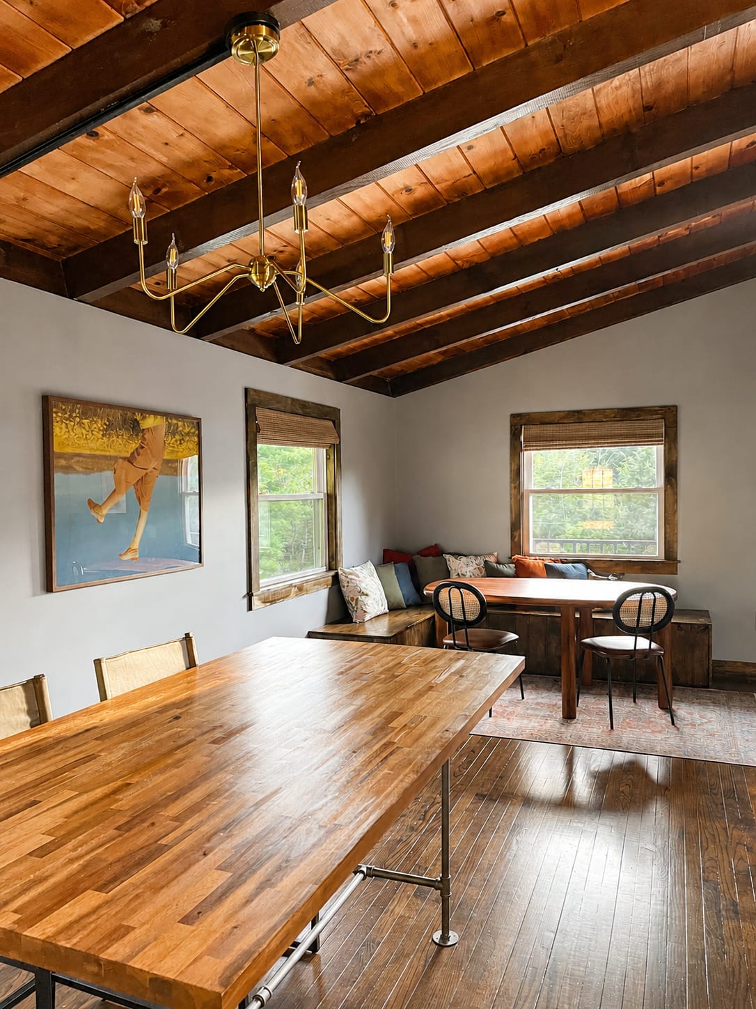
Real homes, real light, real life. A room is photographed the way it is lived in, never staged for the camera.
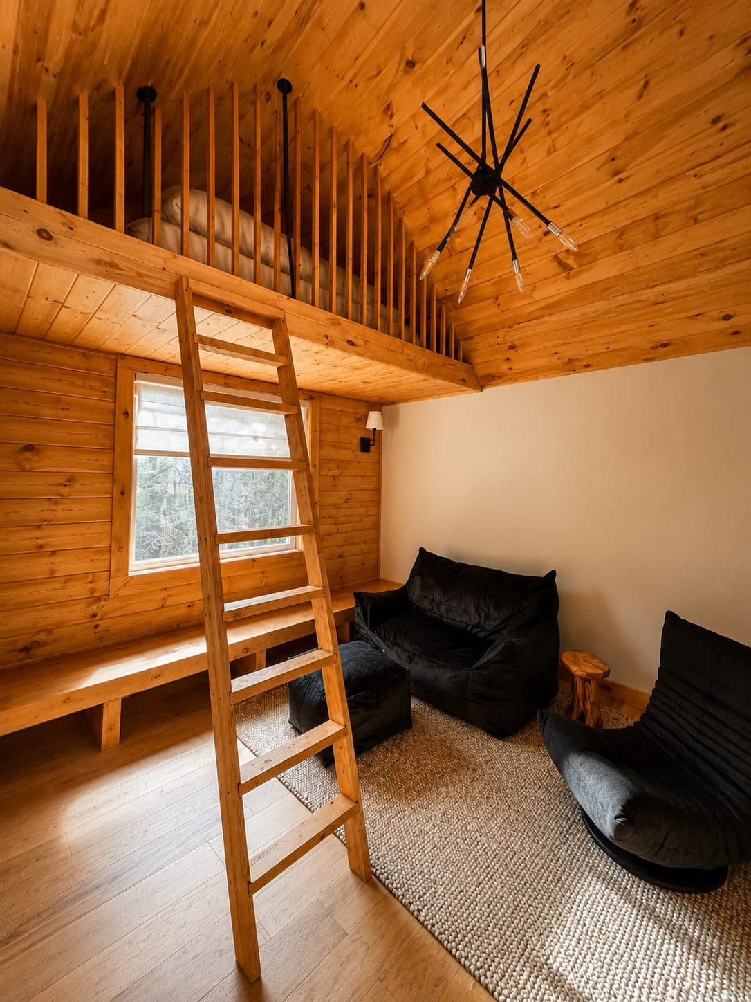
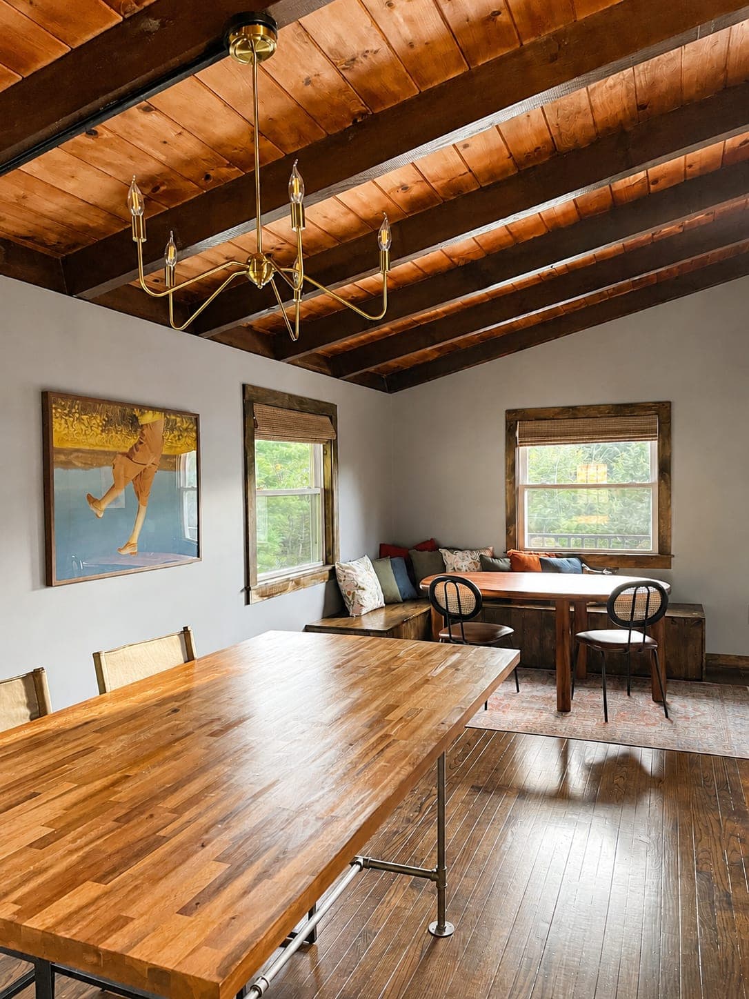
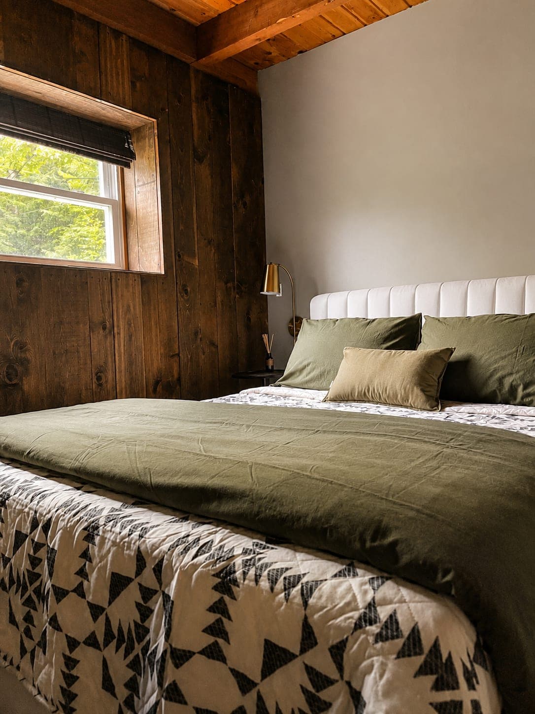

For a Hudson Valley scene that keeps both the place and the palette, shoot autumn at golden hour: reds, oranges and golds, not summer green or water.
08
The brand on the things it is printed on and posted to. Everything here uses the real logo files, the nine colors and the brand type.
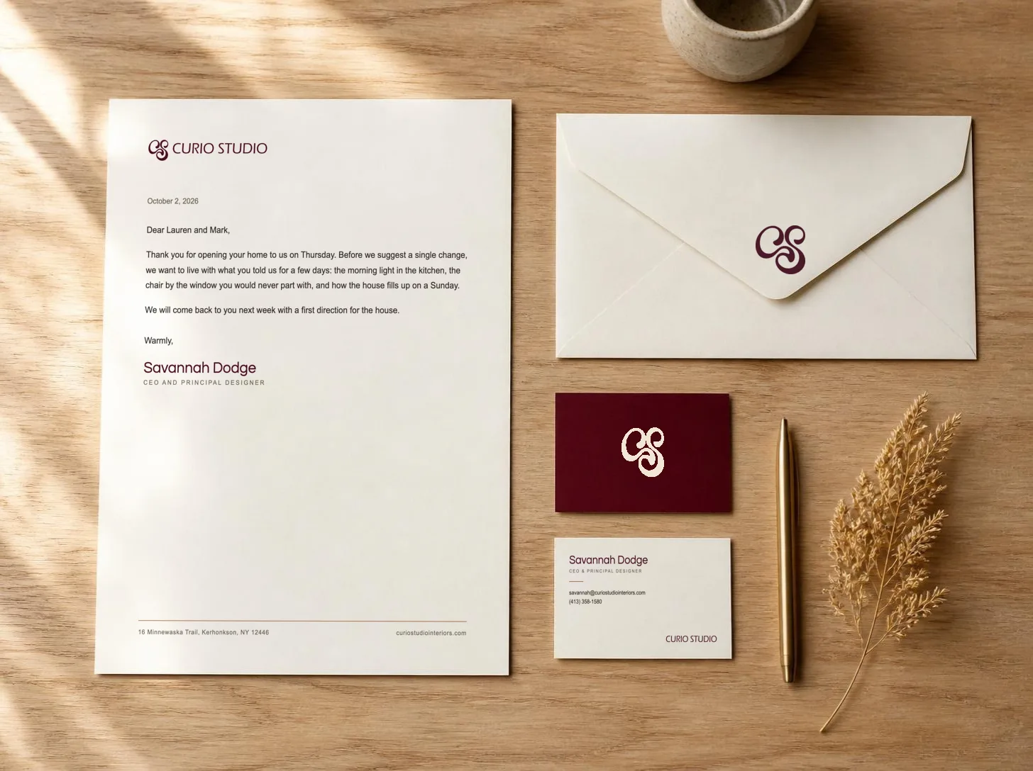
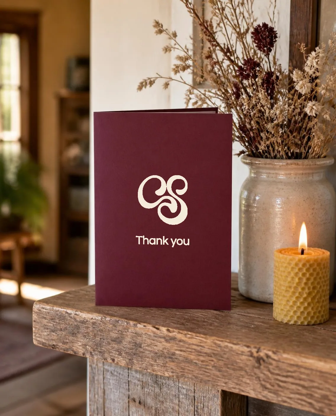
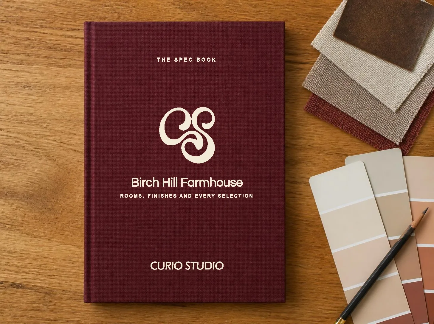
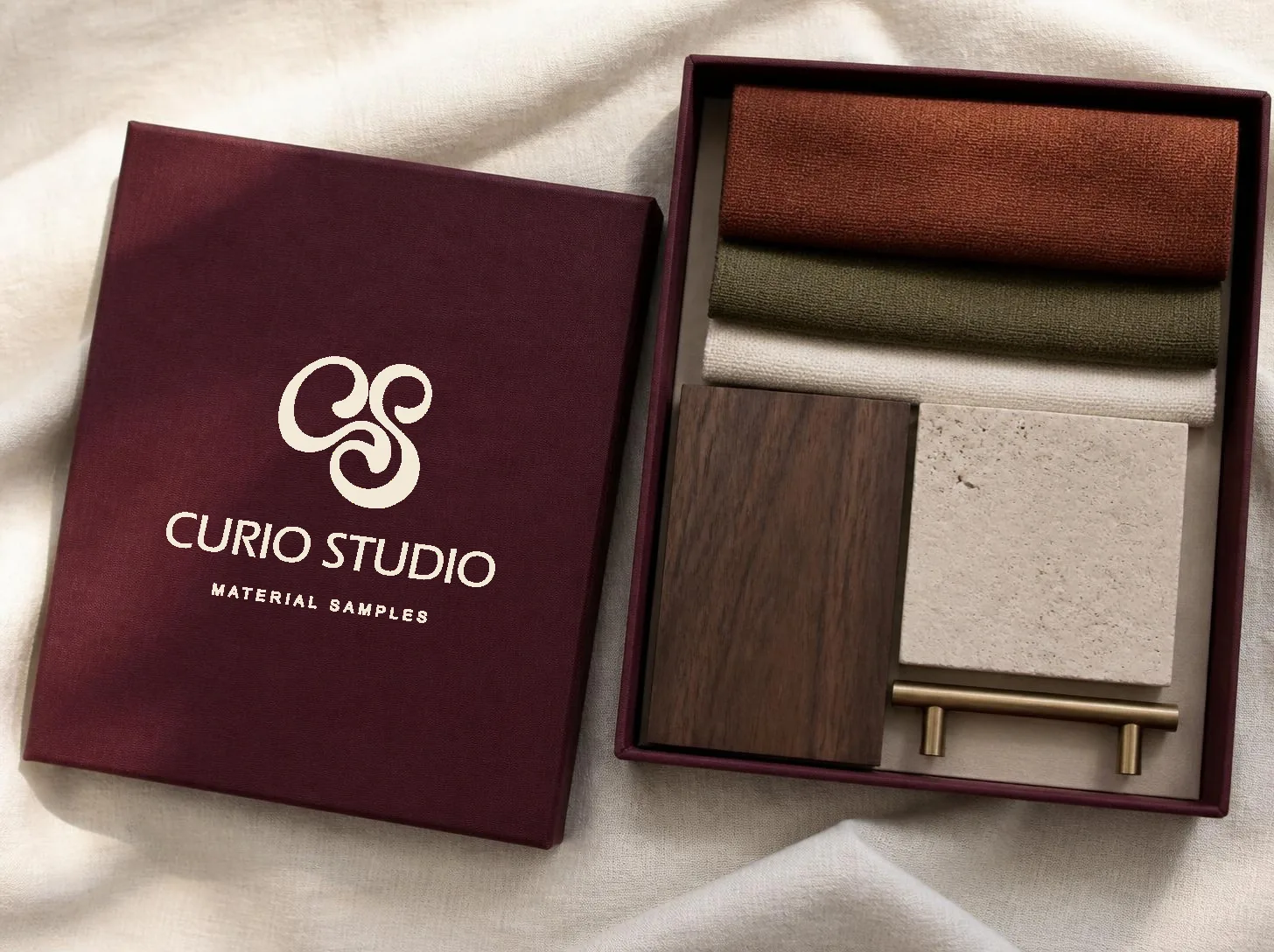
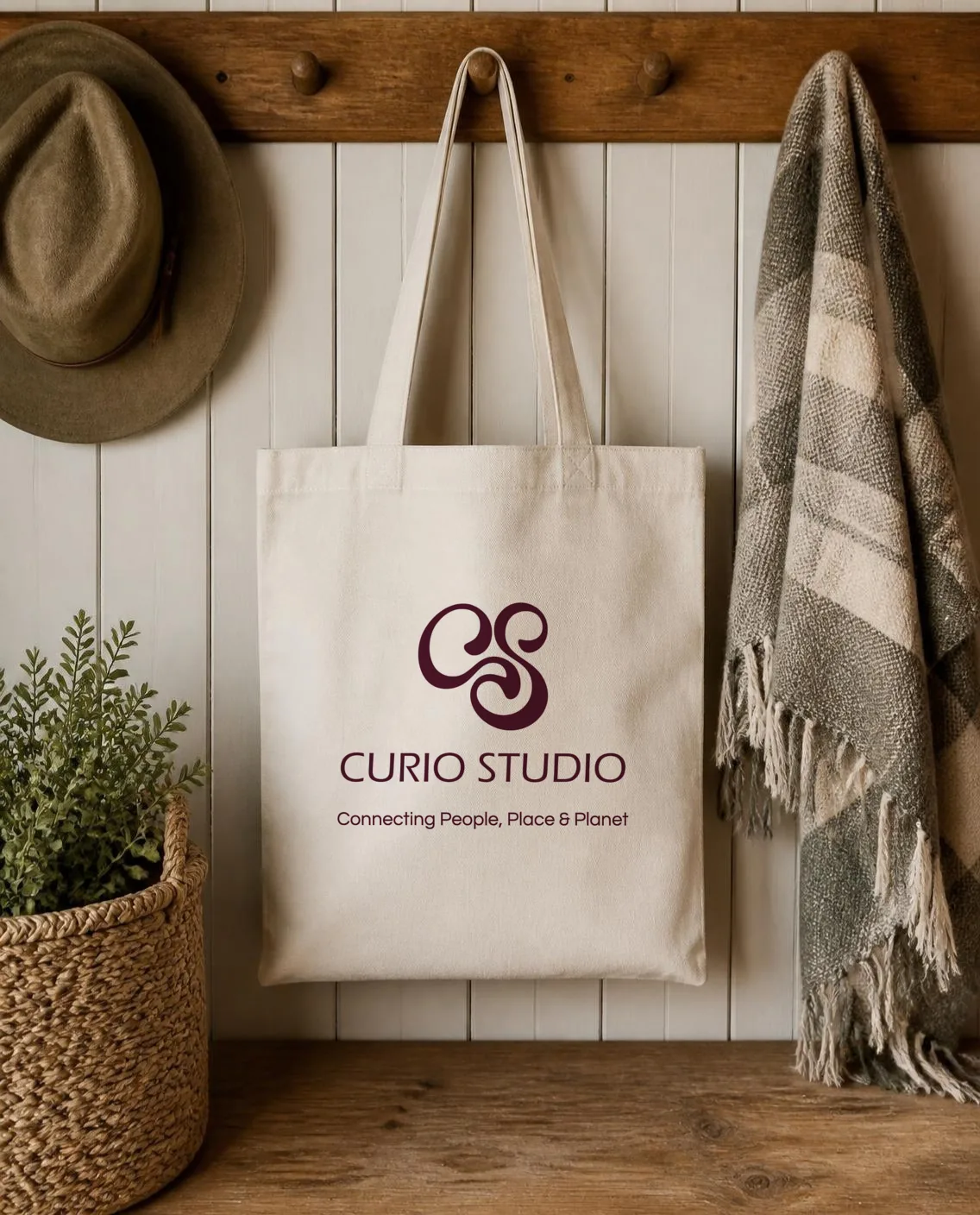
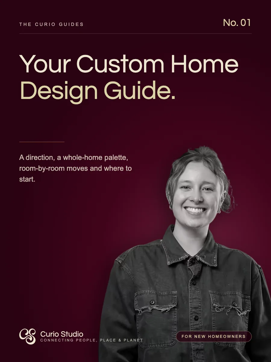
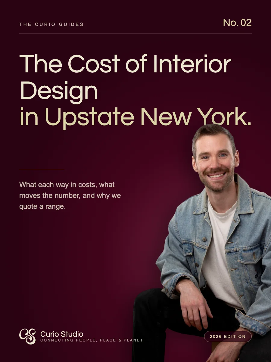
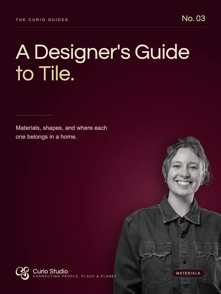
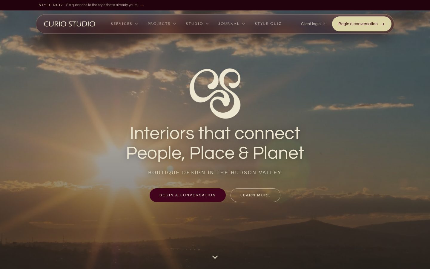
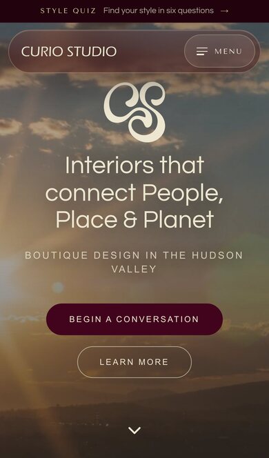
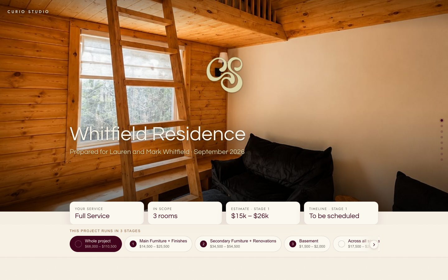 Curio StudioYour kickoff is set
Before we talk about a single change, we would love to hear how your home works on an ordinary Tuesday.
Thursday, October 9 · 10:00 am · At your homeView your project 11:428:15
 14:03
14:03Connecting People, Place & Planet
Residential interior design · Hudson Valley, the Berkshires and New England
Connecting People, Place & Planet
Residential interior design · Hudson Valley, the Berkshires and New EnglandHomes, materials and the questions we ask before we change a thing, from a residential studio in the Hudson Valley.
Warmly,
Savannah
Curio Studio Interiors · Kerhonkson, NY · Unsubscribe
Print pieces are photographs with the real logo files composited in; the rest is drawn from the logo files and palette. The Hale family, Birch Hill Farmhouse, episode titles and the YouTube handle are samples. The website and proposal are live screenshots.
09
Paste these. Do not retype a hex by hand.
Everything in one file
Horizontal lockup, wordmark and monogram in merlot and off-white, the monogram tile, and the favicon set. Outlined SVG and 300 dpi PNG.
:root {
  --curio-merlot:      #42041C;
  --curio-off-white:   #EDE7D1;
  --curio-butter:      #DBD5A7;
  --curio-copper:      #9E653B;
  --curio-copper-deep: #8F5A34;
  --curio-charcoal:    #2A2420;
  --curio-lime:        #A1AD7E;
  --curio-mustard:     #CCAA4C;
  --curio-warm-gray:   #6B6558;

  --font-display: 'Questrial', Arial, sans-serif;
  --font-nav:     'Tenor Sans', Arial, sans-serif;
  --font-body:    Arial, Helvetica, sans-serif;

  --radius-pill:  999px;
  --radius-panel: 28px;
  --radius-card:  16px;
}These are the names the site already uses (bg-merlot, text-copper-deep, font-questrial). In this repo they come from @curio/brand/tokens.css.
@theme {
  --color-merlot:      #42041c;
  --color-off-white:   #ede7d1;
  --color-butter:      #dbd5a7;
  --color-copper:      #9e653b;
  --color-copper-deep: #8f5a34;
  --color-lime:        #a1ad7e;
  --color-mustard:     #ccaa4c;
  --color-warm-gray:   #6b6558;
  --color-charcoal:    #2a2420;

  --font-questrial: 'Questrial', Arial, sans-serif;
  --font-tenor:     'Tenor Sans', Arial, sans-serif;
  --font-arial:     Arial, sans-serif;
}| Color | Hex | RGB | CMYK |
|---|---|---|---|
| Merlot | #42041C | 66, 4, 28 | 0, 94, 58, 74 |
| Off-white | #EDE7D1 | 237, 231, 209 | 0, 3, 12, 7 |
| Butter | #DBD5A7 | 219, 213, 167 | 0, 3, 24, 14 |
| Copper | #9E653B | 158, 101, 59 | 0, 36, 63, 38 |
| Copper deep | #8F5A34 | 143, 90, 52 | 0, 37, 64, 44 |
| Charcoal | #2A2420 | 42, 36, 32 | 0, 14, 24, 84 |
| Lime | #A1AD7E | 161, 173, 126 | 7, 0, 27, 32 |
| Mustard | #CCAA4C | 204, 170, 76 | 0, 17, 63, 20 |
| Warm gray | #6B6558 | 107, 101, 88 | 0, 6, 18, 58 |
CMYK is a conversion, not a spec. Pull a proof before anything that matters goes to press. Merlot and copper shift the most.
Questions about using the brand: savannah@curiostudiointeriors.com.